
Unlocking insight: the power of data visualization
Sprout Social
OCTOBER 3, 2023
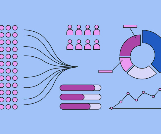
For example, if green represents an increase in sales in one chart, it should represent a decline in negative sentiment in another chart. Graphs – Diagram presenting data with lines, curves, areas, points or segments. Context On its own, data can only tell you so much. It doesn’t tell you if a number is good or bad.


Let's personalize your content