
Unlocking insight: the power of data visualization
Sprout Social
OCTOBER 3, 2023
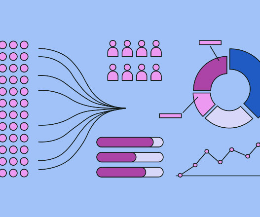
For example, if green represents an increase in sales in one chart, it should represent a decline in negative sentiment in another chart. Some charts show patterns in data while others make comparisons between different variables. The built-in analytics automatically measure your performance across leading social media platforms.


Let's personalize your content