
9 E-commerce Social Media Marketing Tips for 2024
Social Media Strategies Summit
APRIL 11, 2024
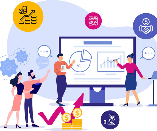
The latest data from January 2024 shows that 93.2% of internet users aged 16 to 64 use social media, spending an average of 2 hours and 23 minutes daily browsing social networks. Combine this with the fact that social media represents the go-to source of pre-purchase information for 44% of Gen Z and 36% of Millennials , and you’ll quickly realize that e-commerce social media marketing is essential for growing your business in 2024.


Let's personalize your content