
History repeats itself once again. In the past, companies didn’t have websites. Then, this thing called the internet hit the scene, and the world saw a relatively quick mass-movement toward marketing businesses online.
Why the change? Because existing on the internet became a standard. Everyone was there. And if you weren’t, you were losing to competitors who were.
The same plot has rung true with mobility and multi-device support for websites and cloud-based applications. We are at an “essentialness” point, as Google has made it crystal clear that websites should be responsive (mobile-friendly).
Just like some companies didn’t think they needed to (and some still don’t) utilize the web, some think they’re better off without a mobile-friendly site. Although 31% of global internet page views occur on mobile devices, 88.2% of websites are poorly designed for these experiences. If your competitors are a part of that 88.2%, now is a perfect time to get ahead.
The following is a quick guide on what you need to know about why mobilizing your site is so important, how to mobilize it, and how to evaluate it.
We’re Not in Kansas Anymore
Since the birth of the mobile web browser on flip phones in the early 2000’s, and with every added layer of “smart,” marketers have had the complex job of managing how websites look across mobile devices.
On our site, www.lesson.ly, we had 446 different screen sizes viewing our website and 340 different screen sizes viewing our mobile-friendly training software, just during the month of June!
To be fair, the vast majority of these sizes easily fall into a handful of categories such as laptop, tablet, or smartphone. Even so, it’s amazing to see the whirlwind of different screens being used, even in a B2B market like ours.
A Brief History of Bricks and Paint
You need two things to make a website (in a very simple world): HTML and CSS. Think about HTML as bricks and CSS as paint. (highlight to tweet this tidbit or any other words in this post, it’s fun!) HTML are the parts of your website that make up the walls of your house, while CSS are the things that make it look pretty.
Before mobile usage of the internet, developers enjoyed being able to create gorgeous websites with one set of bricks and paint. They designed sites for large desktop or laptop computers only, and did not have to worry about any experience smaller than that.
When the first mobile browsers hit the stage, people put up with ugly mobile experiences because it was just cool to have the internet on your phone.
Eventually, the fine people of this world demanded a better experience, so developers started to create entirely separate websites hosted on separate web addresses like “m.website.com” or “www.website.mobi.” This required different bricks and different paint for each device you were trying to design for.
In today’s world, perfectionists would have to create over 400 sets of bricks and paint. That’s a lot! So some brilliant people created the art of responsive design.
With responsive design, you can use the same bricks across all devices, and change the paint according to the size of the browser. This is way easier to manage, and if done well, can provide an amazing experience for the user no matter what device they’re on.
Responsive Design is Ranking, Not Just Efficiency
If you’re not a developer and really just don’t care about the pains of managing multiple sets of bricks and paint, that’s okay. But don’t let your lack of empathy lead you astray. Even without the efficiency and time savings found in responsive design, it is crucial for every business to implement today.
The reason? Google says so.
They have proclaimed that having responsive design is the way is the best way to go, and their search engine results are now reflective of that. Learn a lot more about Google’s view of mobile SEO here.
But how do Google’s robots know what my site looks like on a mobile device? They don’t have smartphones, do they?
Don’t worry, they don’t have smartphones… yet. But they can look at your site through different lenses using the power behind responsive design and SEO: media queries.
Introduction to Media Queries
Media queries are CSS triggers that you can use to create conditional logic based on a minimum or maximum screen size. Said another way, you can change the look of your site on a device that is 200 pixels wide vs. one that is 900 pixels wide.
Here’s an example:
@media screen and (min-width: 10px) {
div.icon {
color: red;
}
}
@media screen and (min-width: 320px) {
div.icon {
color: orange;
}
}
@media screen and (min-width: 768px) {
div.icon {
color: yellow;
}
}
@media screen and (min-width: 1440px) {
div.icon {
color: green;
}
}
In this case, if you are viewing the page on an iPhone, the brick called div.icon would be orange; on an iPad, it would be yellow; and on a MacBook Pro, it would be green.
Obviously, you’re probably not going to change colors based on width all that often, but responsive design can be used on pretty much anything. Learn more about media queries here.
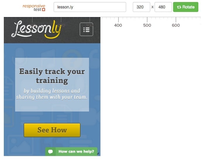
Test with ResponsiveTest.net
Is your site responsive? Do you know?
Here’s how you can find out. Head on over to ResponsiveTest.net and type in your website. Hit enter on your keyboard, and see what happens when you view it in different sizes. You can either drag the window sizing, or you can even select from a list of common computers, tablets, and smartphones to see what your site looks like on them.
I recommend evaluating a few devices in each category to see if you have an optimal experience.
Example of an optimal experience:
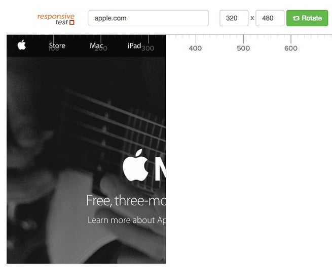
Example of a non-optimal experience:
(Disclaimer: I have no formal affiliation with ResponsiveTest.net—I just think they do a great job.)
Also, ResponsiveTest.net will allow you to understand visually how your site works on different devices, but if you want to know what Google thinks of your site’s web design and SEO, check out their Mobile-Friendly Test.
Get more content like this, plus the very BEST marketing education, totally free. Get our Definitive email newsletter.