


There’s a new look for Facebook Pages. You’ve probably already seen and noted the changes yourself on your own Page.
So how can your business take advantage of these Page changes? Let us run down the changes and how you can benefit from them.
1. Cover image moves to the foreground
First, you probably noticed that the Page’s profile image has moved to the left and is no longer overlapping the cover image. Before the change, Page managers had to make sure that any cover image they uploaded didn’t have important elements that were covered in some way. For example, if you wanted to include a quote in the image, you’d have to make sure part of the quote was not covered.
When there was overlap, the focus was on the profile image, and the cover image acted more like a background—especially in its placement “behind” the profile photo. Many Pages treated it as a background: some used pattern images, others uploaded photos of clean desks with empty space in the lower left for the logo to pop. Now the cover image is presented to the user with an unobstructed view—and that means you have to take a different strategy.
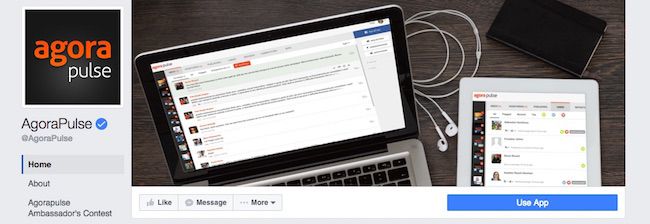
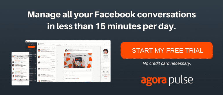
If your cover image is currently a “background” photo, you might want to change it out for a more “active” photo. For example, Agorapulse shows a computer and tablet open displaying its software product. You might choose to show off your products or the people behind your company, but keep in mind that the logo has been shifted away to put your cover image “front and center.”
You used to have to keep the “weight” of your cover image to the right to counteract the extra “weight” of your logo as it overlapped on the lower left. Now the cover image balance tips the opposite direction.
On desktop, it has shifted to the right to make room for the logo, so that the left half of your cover photo is in the center of the Facebook Page. On mobile, the cover image is central with the logo beneath. You might choose to make sure the lines or weight of the cover image bring attention to your logo. As you can see here in Agorapulse’s cover image, the lines of the laptop point to the left and downward so that your eye will be drawn to the logo on desktop and on mobile.
2. More emphasis on tabs
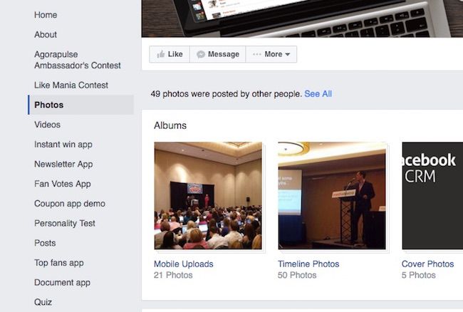
You likely have noticed that the tabs have moved on desktop view. This is where your apps were located. They used to reside underneath the cover photo, but now they are in the new left margin underneath the profile image.
In the past, users could only see the first few tabs and it would take an extra click to see if your Page had any other tabs to view. Now the the new left-hand menu shows all your tabs, meaning a user could potentially see all the choices (if your list is long, the last few might be viewed with some scrolling).
This new emphasis on tabs means that ordering your tabs by importance may not help you like it did in the past. The first few should be your most important, such as home, about, then perhaps videos if people are more likely to buy your product after seeing a video of it in action.
If your list is long, you may want to help your customers find what they need by giving it some order. You might sort them by alphabetical order or use similar words for similar apps. If you have many demo apps, for example, call them “Contest demo,” “Video demo,” and “E-book demo.”
3. More prominent call to action
Another highlight in the recent change is that the call to action button doesn’t overlap the cover image and appears bright blue. This new placement and style will hopefully make the call to action button better able to incite action! And it stands out separate from the other buttons, which remain gray.
It’s clear that you should take advantage of this button now more than ever before, but how? There are multiple options, such as “send email,” “call now,” or “send message.” Think carefully through this decision. What do you want your customers to do? If you want them to buy products online, then the call to action should be to visit the website.
However, if you offer services that require a phone call to initiate, a button to call you now would be best. For example, if you own a restaurant, your Facebook Page and your website are both one action away from calling for a reservation. Linking the button to your website doesn’t help your customer like a “call now” button would.
4. Upfront analytics
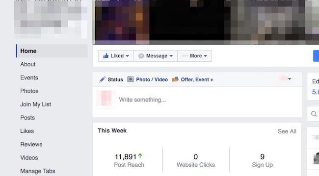
What I found most interesting about the change in the Facebook Pages layout is the section that appears above posts for those who have access to the Page (in other words, visitors do not see this section). It is an Insights overview section called “This Week.” It shows post reach, website clicks, and call to action clicks for the past week. This is the first time anything from the Insights feature makes its way to the Page. To me this shows that Facebook is encouraging Page admins to measure the impact of what they are doing on social.
One great way to improve your social media is to look at impact and how the content performs so you can make changes that will improve the benefit to your business. Now that Facebook has included the “This Week” section, you’ll get a reminder to view your analytics and make better content and engagement choices.
Every time you login and view your Facebook Page, click on the “See All” link in the upper right of this section. It will take you directly to your Insights. Once there, view your Page Summary and other sections.
The Facebook Pages layout has changed. Have you?
The layout change is a great reminder that iteration is key to success. Online behaviors are changing, so Facebook is changing to meet new needs and find better ways to serve its customers
The question is, are you changing?
With the changes in the layout, make some changes yourself on Facebook. Start with something small. Perhaps swap your cover image for an image that is better balanced in the new layout. Or reorder your tabs and see if it has any impact on engagement. Look at your Insights and see if the time your scheduling your posts to publish is still an active time for your users.
Share in the comments what you think of the new Facebook Pages layout!


